KeVita
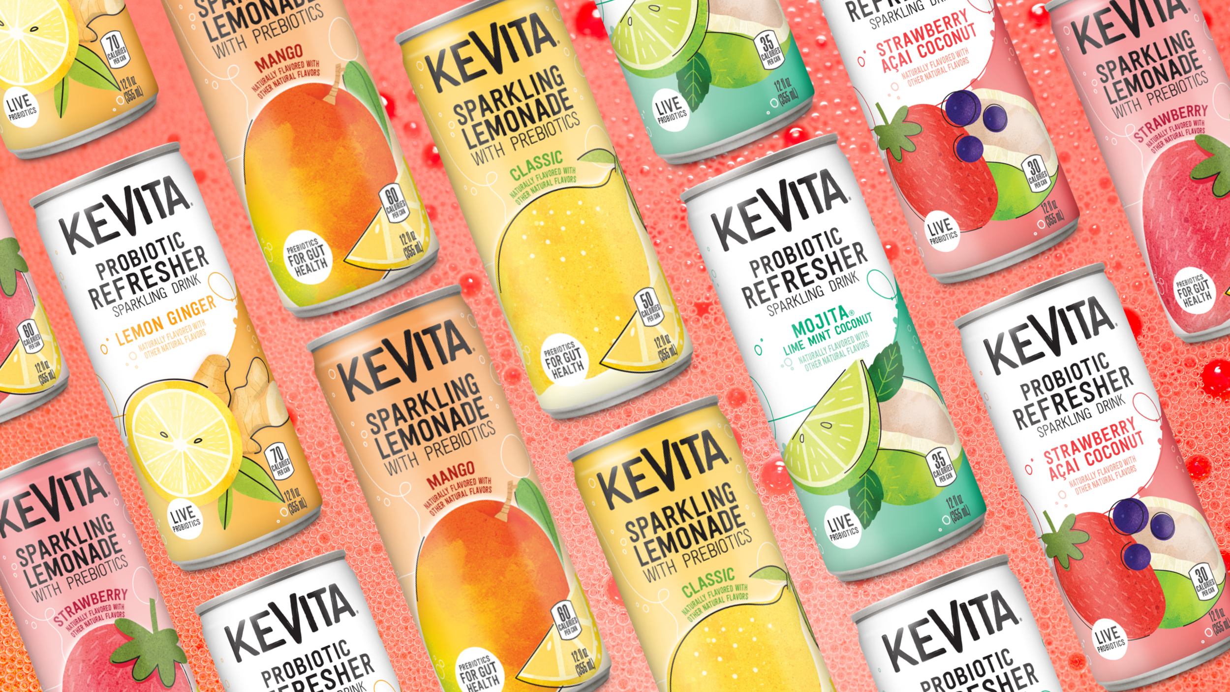
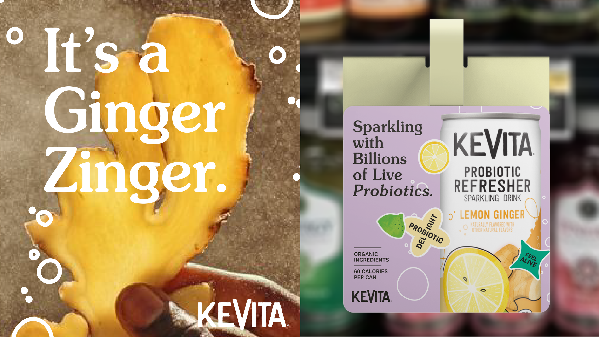
KeVita is the “OG” pioneer in the gut-health space. It has now evolved gut health beyond a brown bottled kombucha, with the creation of the first ever Sparkling Probiotic Beverage, in a colorful can.
-
KeVita, a pioneer in Kombucha drinks, was expanding beyond its traditional bottled drinks with a new canned prebiotic format. My challenge was to build a flexible and flavor-forward visual language that celebrates what already exists and amplifies it into campaign, digital, experiential, and social spaces. The design needed to stand apart from the medicinal-feeling Kombucha bottles by communicating taste appeal and product benefits—transforming KeVita from a niche wellness brand into a vibrant, culturally relevant choice for a broader "gut health curious" audience.
-
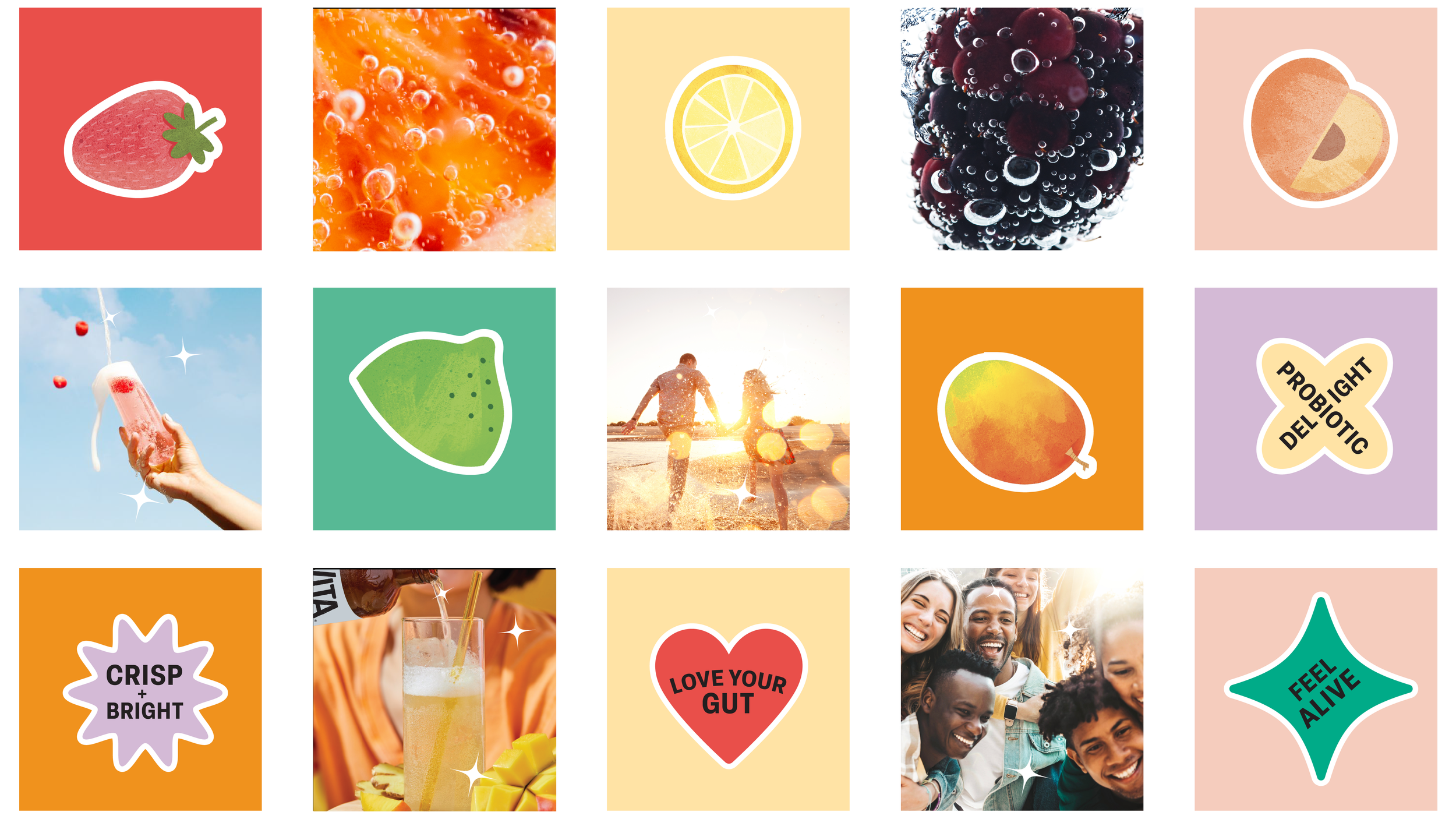
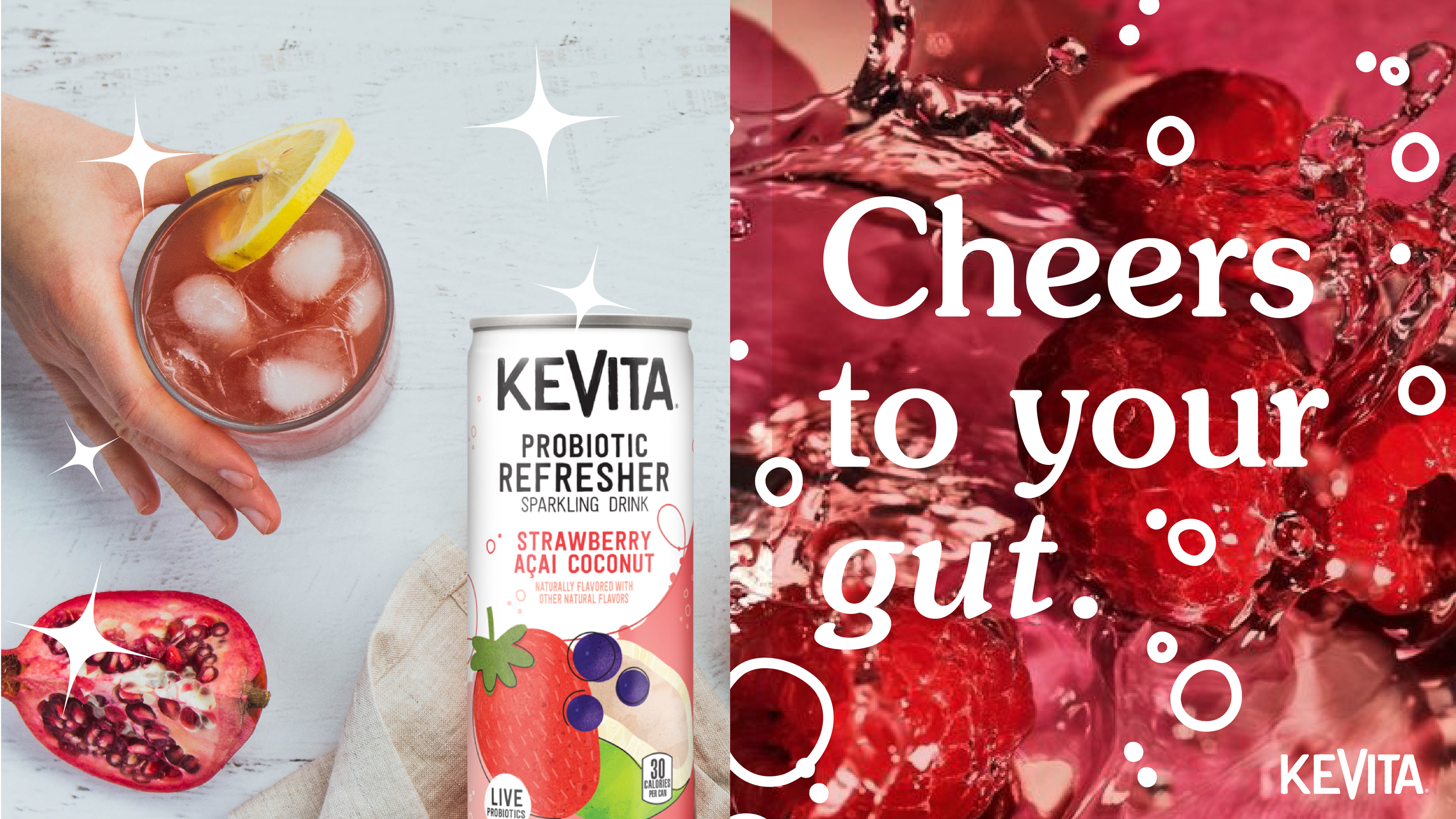
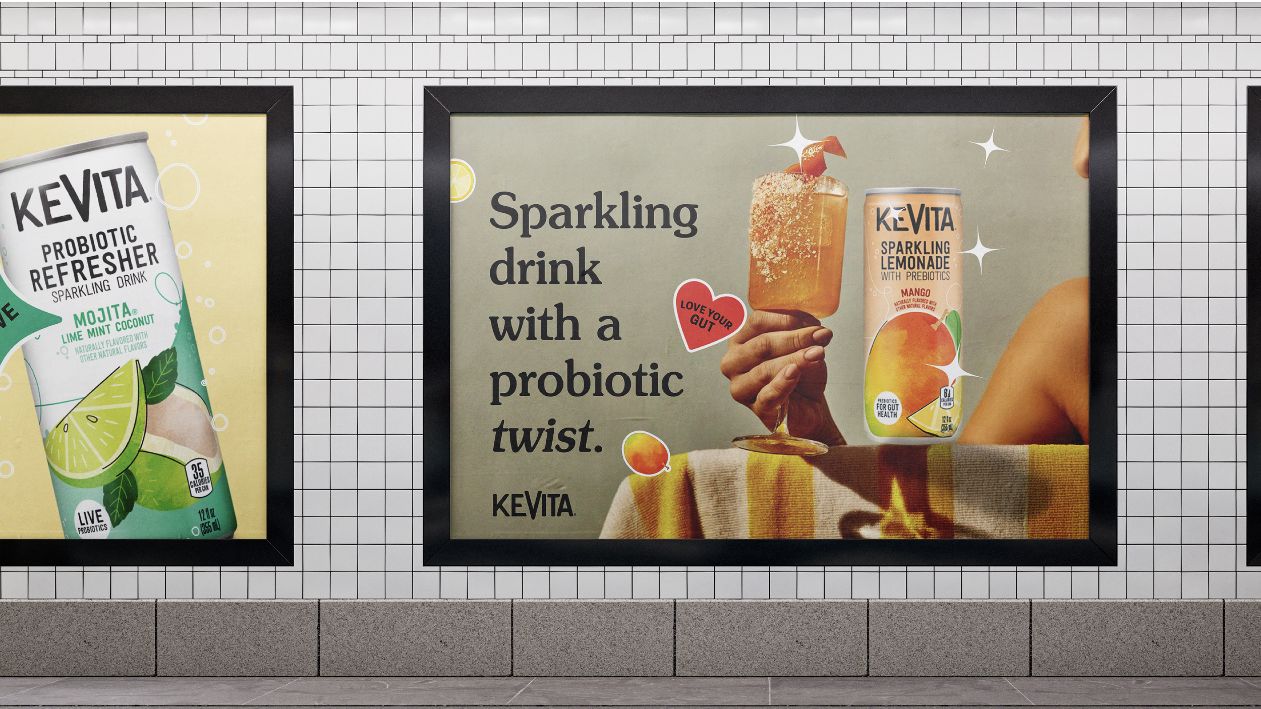
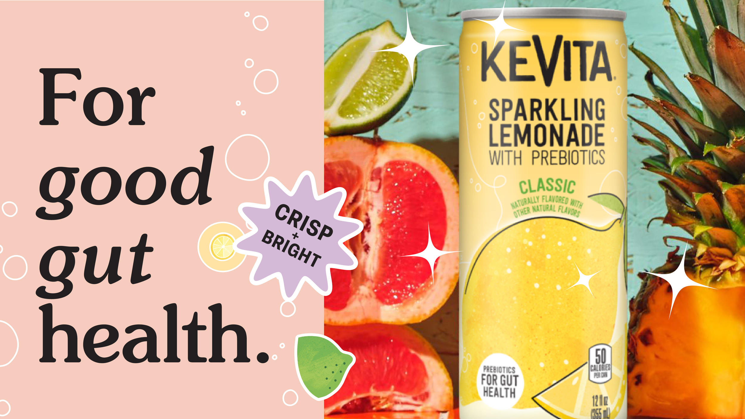
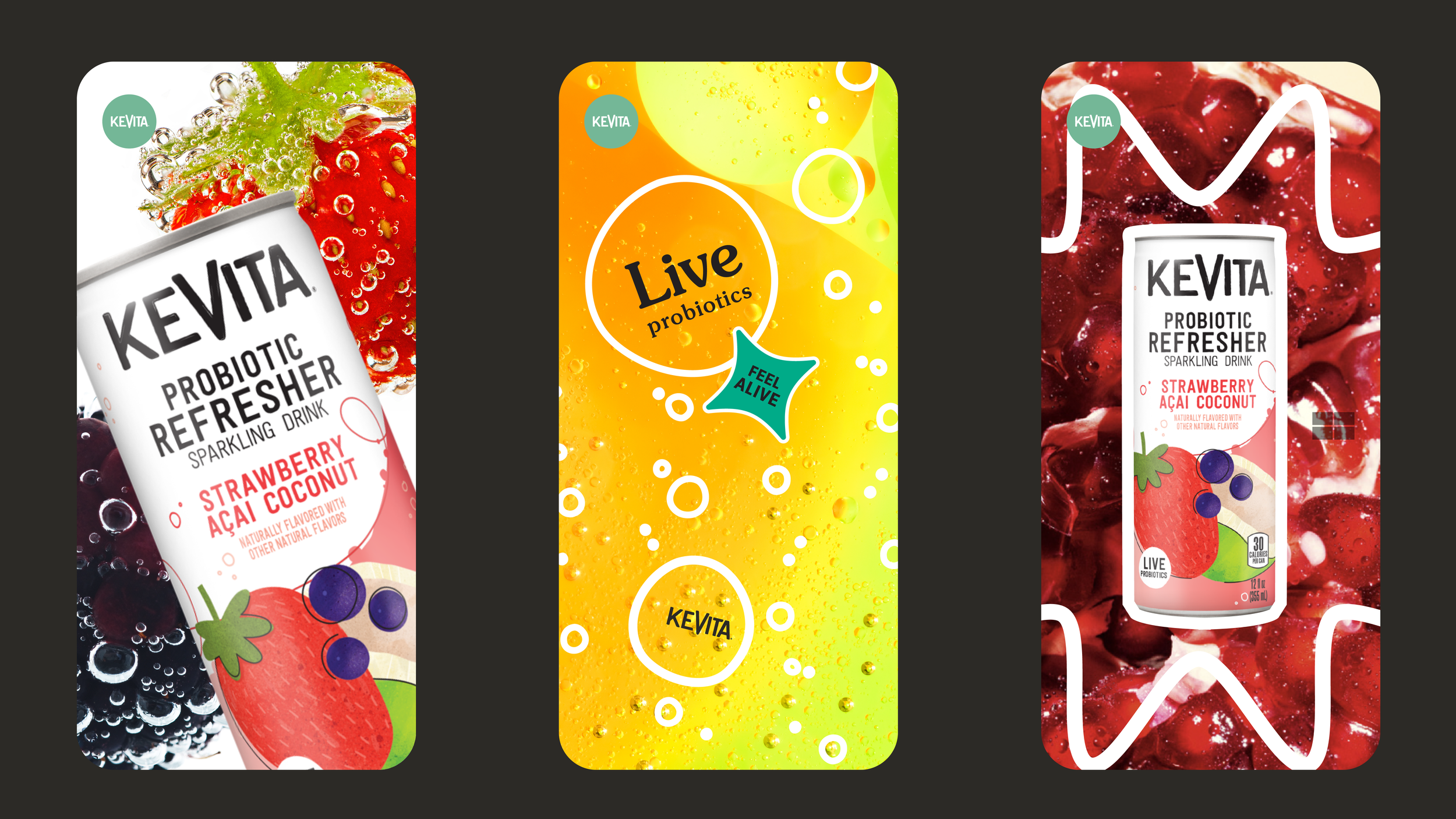
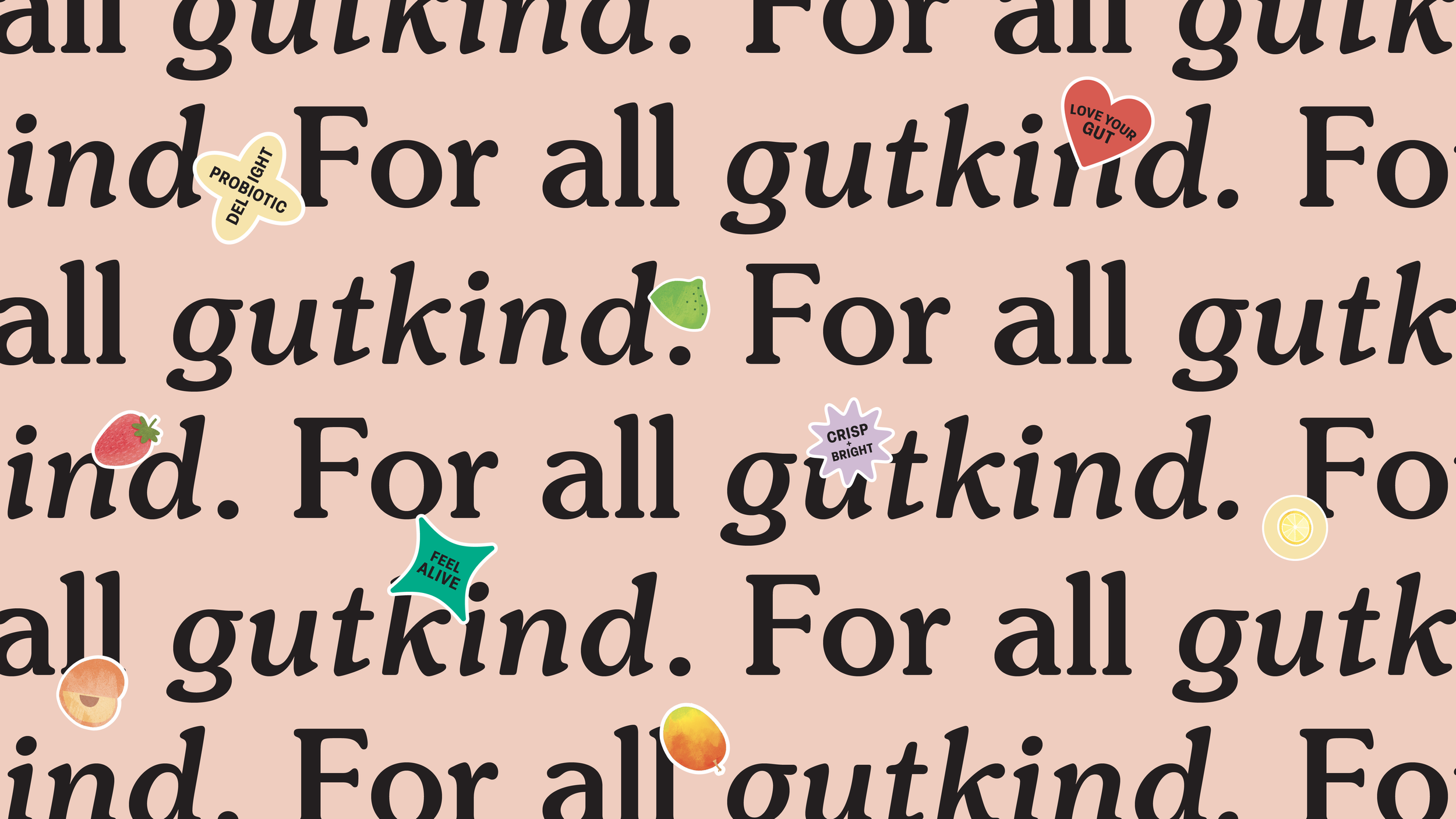
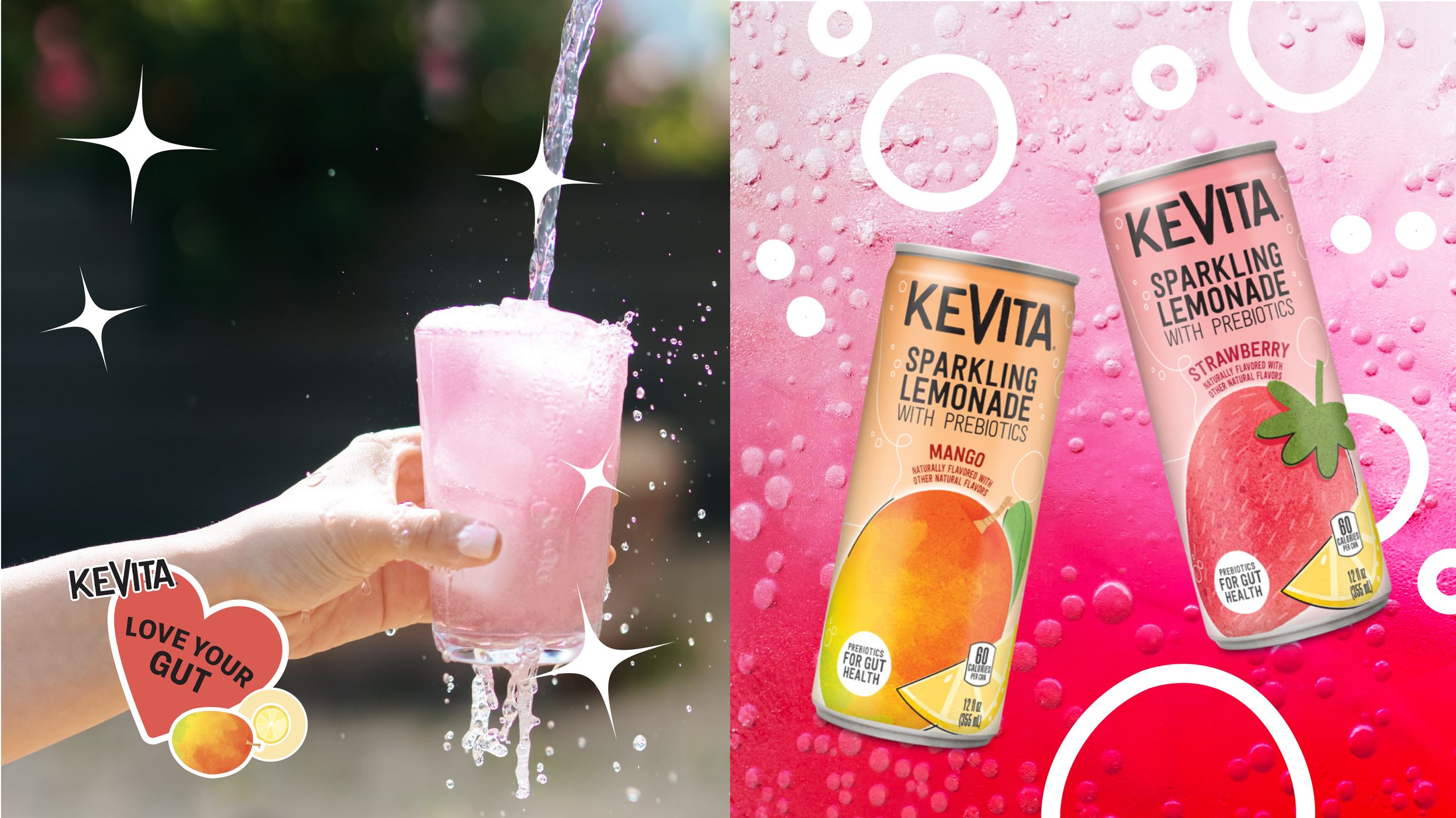
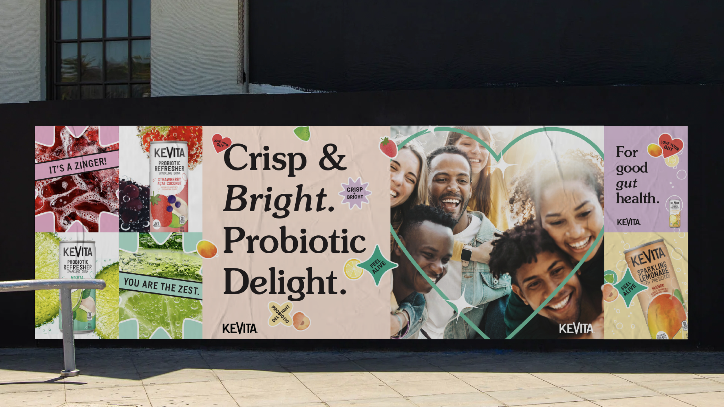
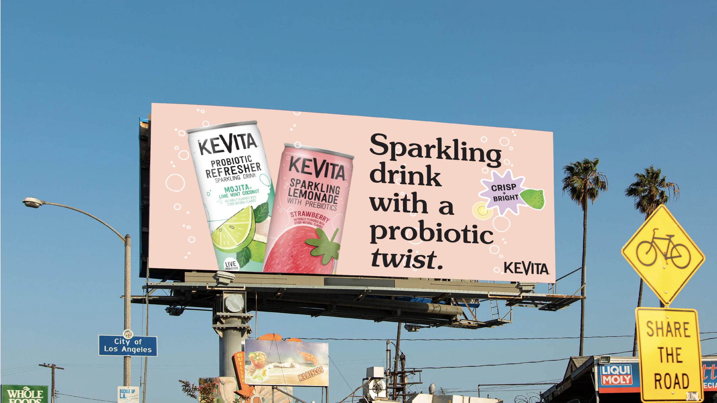
To bring KeVita’s new brand world to life, I began by immersing myself in the competitive landscape—analyzing everything from functional beverages and sparkling drinks to Gen Z-focused brands across food and wellness. Across the board, honest, authentic, and playful messaging paired with bold and ingredient-led visuals emerged as key design drivers. Building off KeVita’s existing can designs, I created a cohesive visual identity that retained the brand’s equity while injecting it with vibrant energy. Clean, approachable typography underscored the drinks’ functional benefits, while vivid, juicy photography of real fruit and effervescent pours conveyed bubbly refreshment and great taste. To make gut health feel fun and culturally relevant, I introduced playful “sticker” graphics to highlight ingredients and benefits, signaling that wellness doesn’t have to be serious or medicinal—it can be enjoyable, expressive, and full of life.
Visual Identity
Brand Messaging
Art Direction