Eat Your World
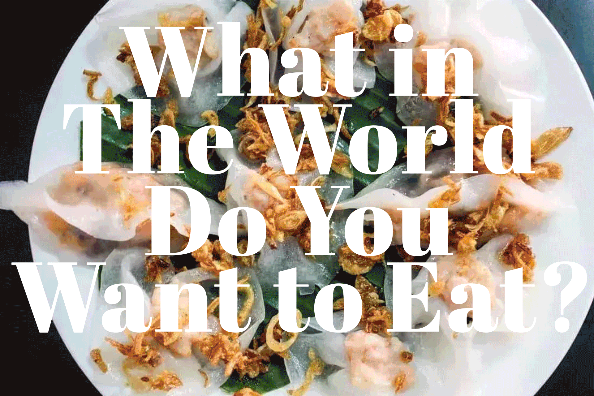
Eat Your World is a global guide to local food, built on the idea that what you eat depends on where you are. Since 2011, it’s grown into a deep archive of regional dishes, cultural context, and user-submitted finds—alongside a very real, very beloved Queens food tour business.
-
The site had evolved organically over time. Editorial stories, destination guides, and tours lived in separate corners of the internet, with different visual languages and uneven UX. The brand itself was warm and opinionated, but the design didn’t fully express that personality—or guide users clearly from discovery to action.
The experience no longer reflected the richness of what Eat Your World had become.
My role was to rethink Eat Your World’s visual identity and digital experience as a cohesive system: one that could support storytelling, exploration, and booking without losing the scrappy, food-first spirit of the brand.
-
My goal wasn’t just to redesign the site, but to realign the UX with how Eat Your World actually works today.
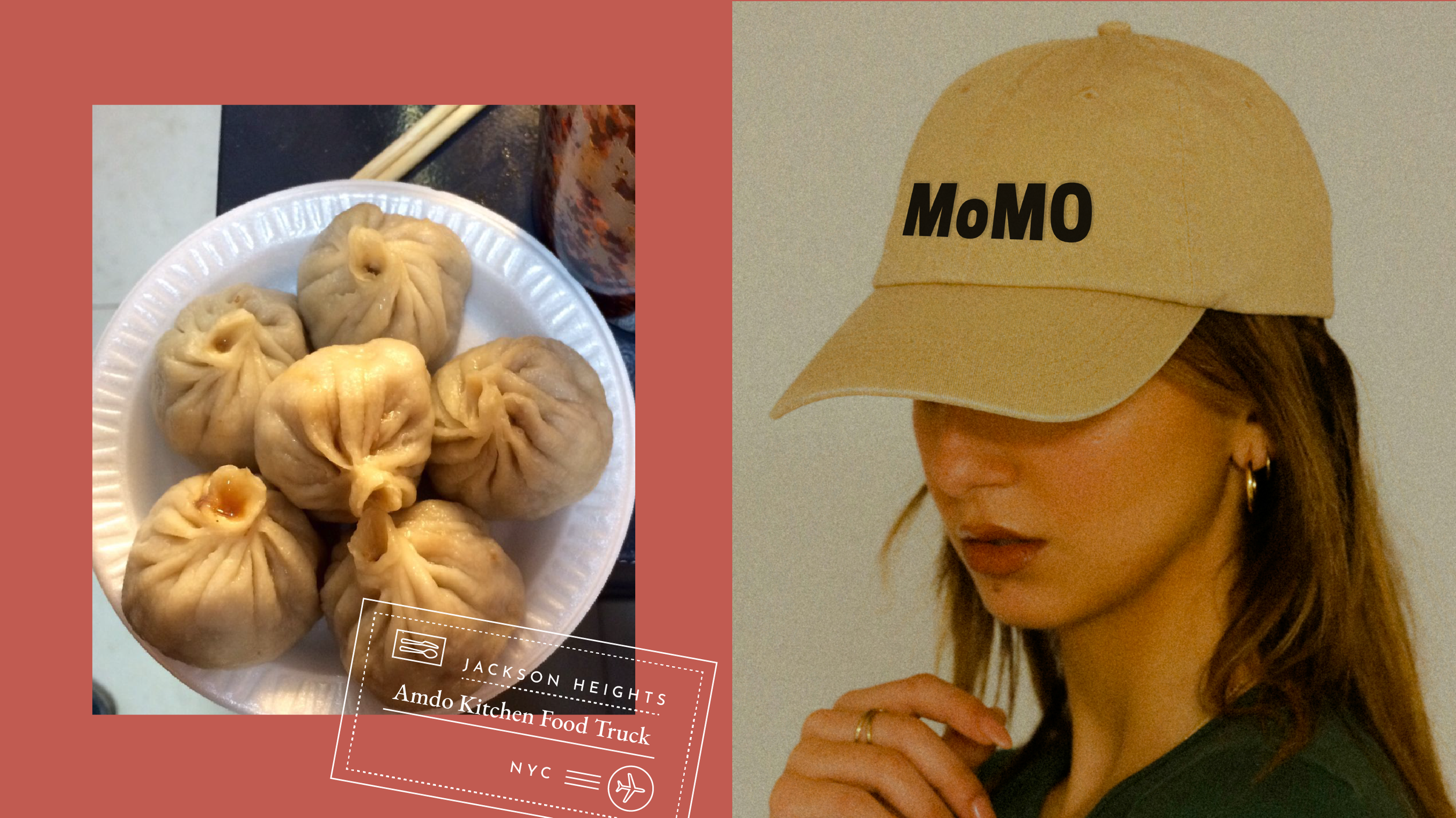
I believed the food tours needed to become a core entry point, not a side path. That meant bringing them onto the homepage, clearly differentiating each tour, and designing a booking experience that felt obvious, trustworthy, and easy to use. Each tour needed to quickly answer a few simple questions: what makes this tour unique, who is it for, and how do I book it?
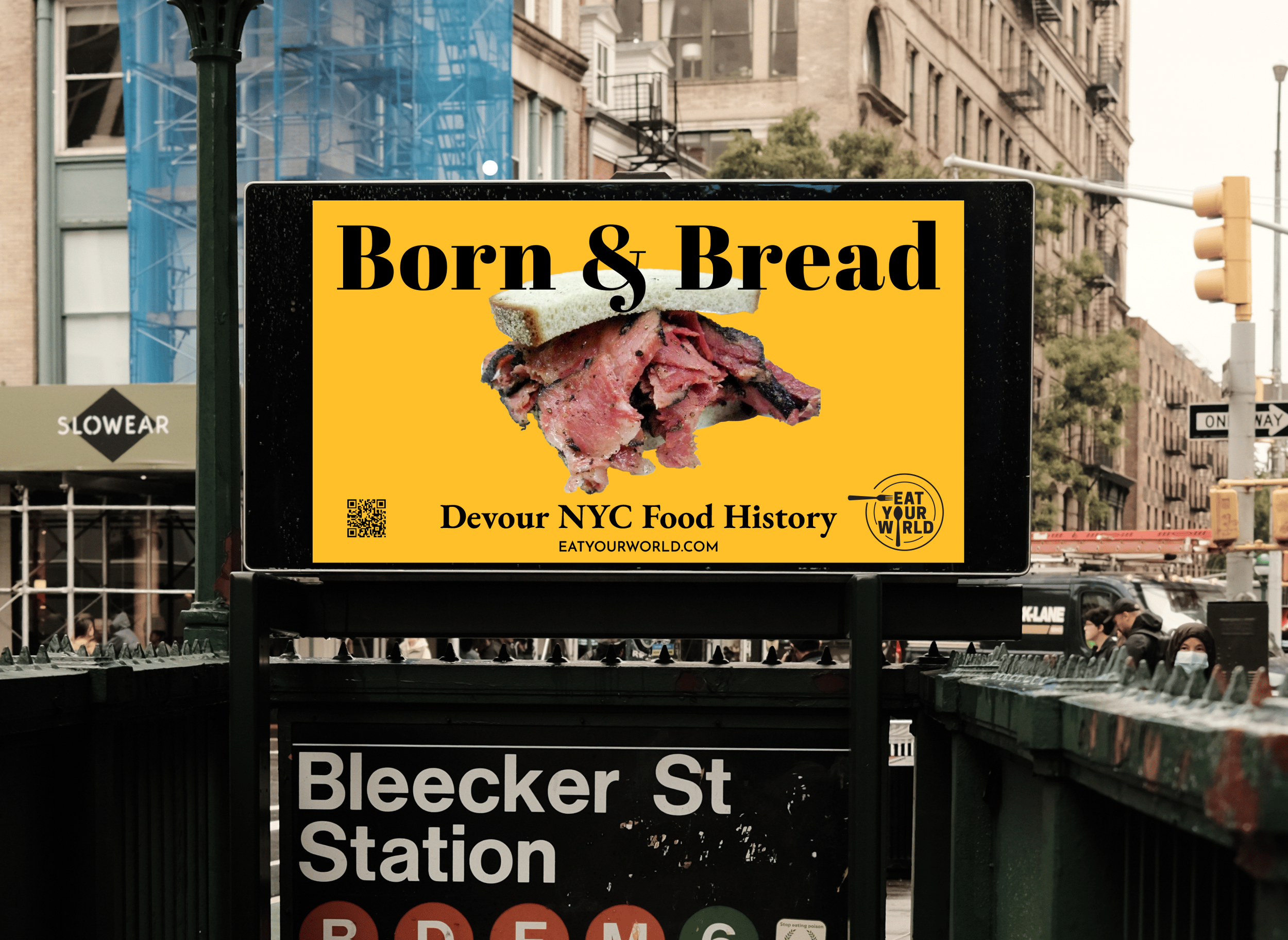
At the same time, the editorial side of Eat Your World is essential to the brand. New food stories are submitted regularly, and they function more like food news—similar to how Eater or Grubhub surface what’s happening now. I wanted the design to give those stories visibility without letting them overshadow the tours, while also highlighting Laura’s expertise as a local food authority.
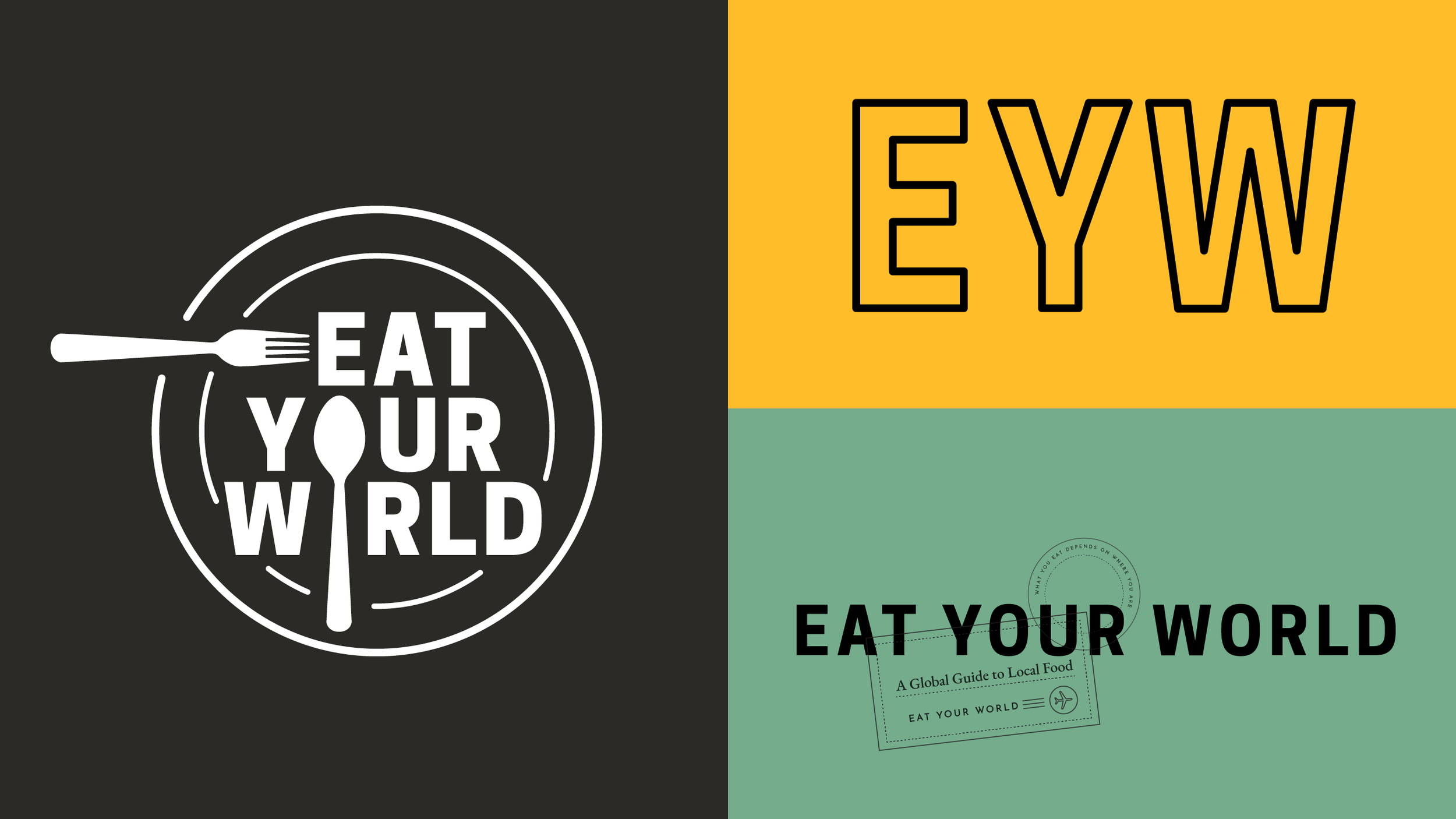
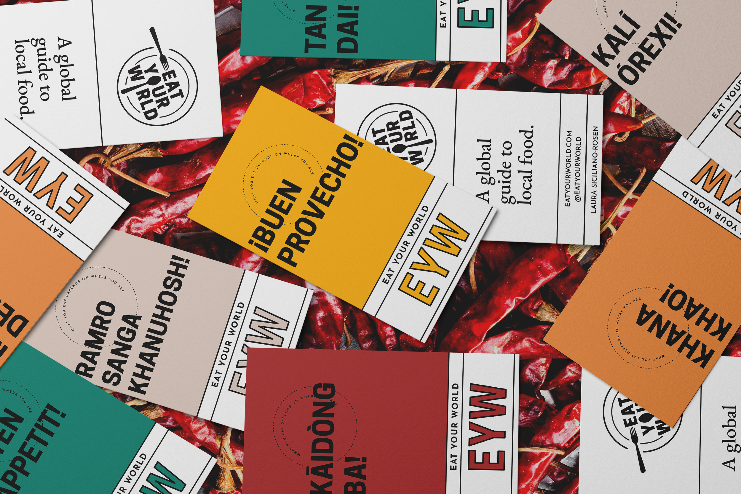
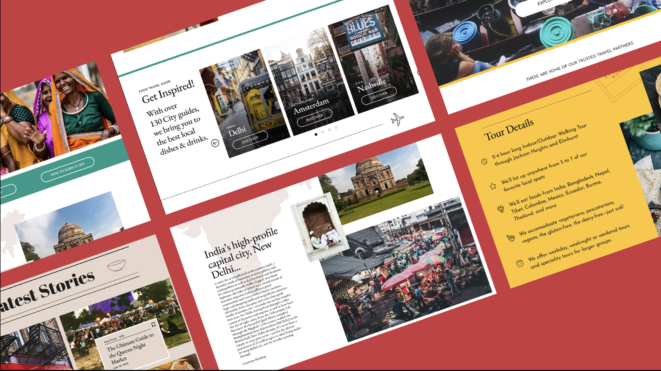
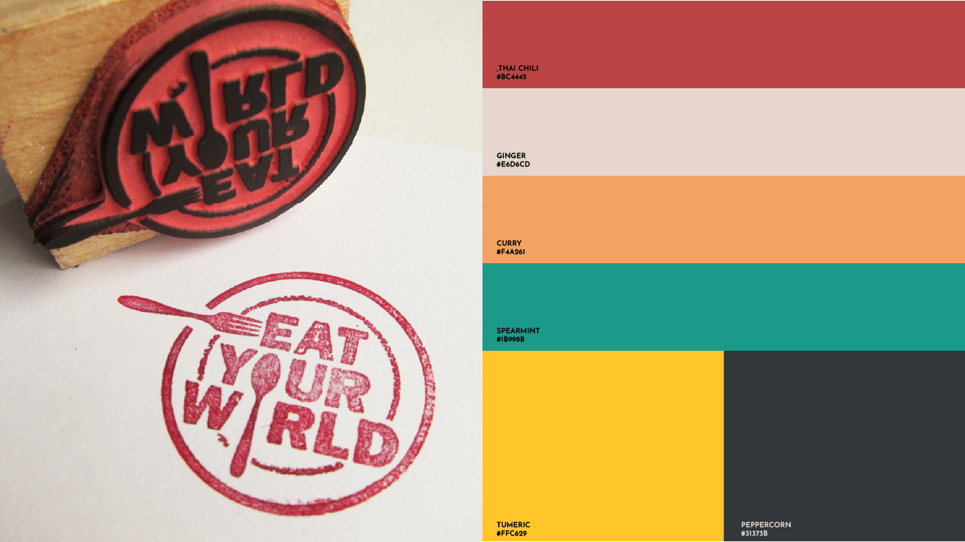
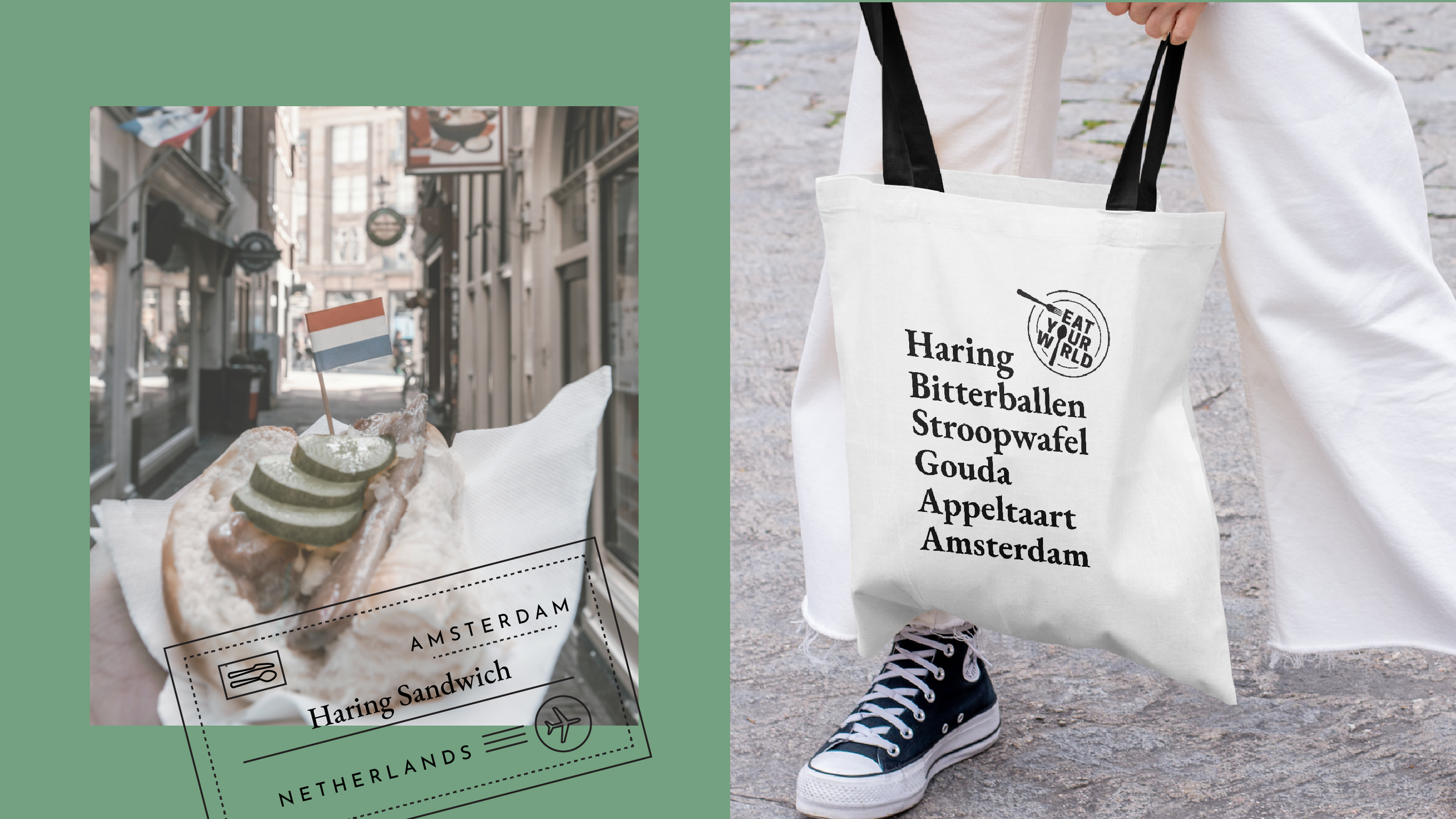
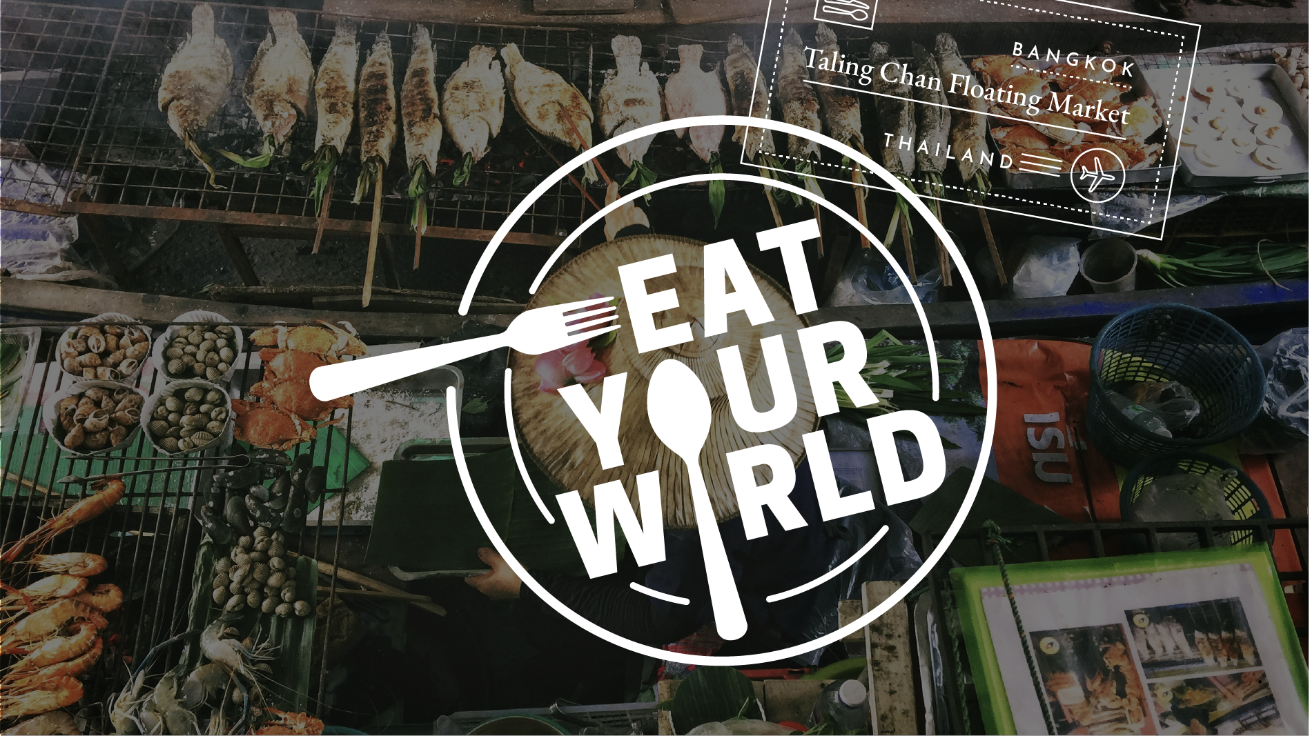
I redesigned the visual identity and UI to feel more editorial, modern, and culturally grounded, drawing inspiration from street food, spice markets, and the visual language of travel. The UX was restructured so tours, stories, and destination guides could live together naturally, with clearer navigation and a fully responsive experience across desktop and mobile.
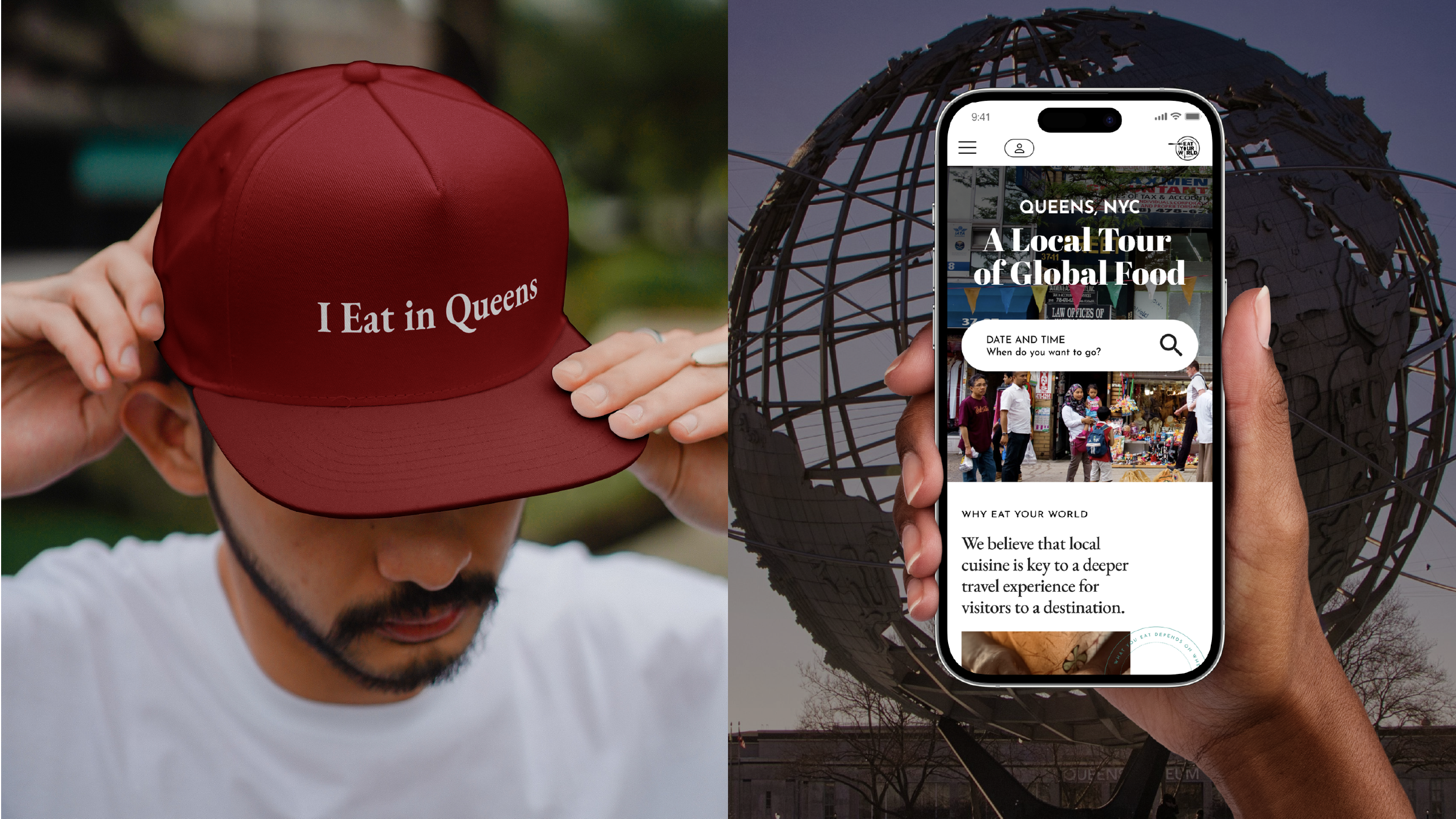
A major part of the work was redesigning the Queens Food Tour experience and introducing an embedded booking flow with calendar availability and payment. Budget was a real constraint, so the system was designed to be straightforward for developers to implement—improving the experience without requiring a complete backend overhaul.
The result is a site that feels more confident, more usable, and more aligned with the business. Traffic has increased, booking a tour is now more seamless and intuitive, and the design finally supports the way people actually engage with Eat Your World—whether they’re discovering a dish, reading a story, or booking a food tour in Queens.
Branding
Visual Identity
UX/UI Strategy
UX/UI Design
Merchandise